Saturday, December 11, 2010


The Zimmerli water show as a unit is well-composed. The content was strong and believable.  The concept of water felt very well covered.  There is a nice flow, which keeps with the water theme.  The lighting is dimmer than normal gallery lighting would be.  The color they painted the front introductory was a wise choice as it is a warm enough tone that worked with the golden color lights. The lights and the color of the wall made a strong team to set the mood.  The opening piece, net full of bottled water, was an unusual choice but it is extreme looking enough to also contribute to the mood set by the lights and colored wall.  Also, the pre-existing floor color helped pull these elements together.
                There are a large variety of works displayed, which lends itself to the broad theme of water.  Water as a subject is very complex.  As an artist who works with subjective water regularly, I know that I got a lot out of the show that I will be able to apply to my own ideas. It was sort of like going to the “art doctor”.  Even thought I think the variety in the show is very valuable, there are too many pieces on display.  Things were very close together and a lot of them did not complement each other, which created a lot of visual tension.  For example, a photograph would be hanging in a frame with a glass pane covering it right next to an oil painting.   Combinations such as this look amateurish, like a high school art show where every piece is hung differently.  In addition, I think the presentation led the rooms to feel unbalanced.  I also felt that the arrangement of the pieces could have made more sense.  I was distracted by how different some things looked next to each other.  I feel that there were many pieces that should not have been included at all.  At times I felt that the show included certain pieces simply because they referenced water, not matter the quality or aesthetic value.  I think the curators could have been a bit pickier with what they decided to include.
           The piece in the show that stands out the most to me is the river made out of small nails.  I’ve never seen a piece like this before. It felt very fresh.  The color of the pins lent itself to water very easily.  The liner layout of the pins was very interesting and balanced as well as unpredictable.  The selling point of the piece was the casted shadows on the wall coming from each pin.  I think that is a very strong piece with support from excellent installation. 


                     The second piece I am going to discuss is the installation of blown glass.  This piece is very unusual and clever.  The way the over-sized glass “droplets” bent the light and created glares truly made the scene look like real water.  Water holds color through reflections from the inside and also on the outside.  The glass mimicked this very well, especially in picking up the wall color.  There were also these beautiful reflections on the wall behind the glass pieces that were against it.  This also really lent itself to the way water behaves. 
           
                  The last piece I would like to discuss is the set of three monotone photographs.
I really appreciated these in the show because they really aren’t completely about water.  I feel like they are more about restoration of life through water.  These show how water truly is liquid life and can restore hope in people.  These made me feel quenched, like I was standing right in the falls with the people.  It feels like there is a quiet desperation; a thirstiness that is in process of being relieved.  I can feel the cool water running across my skin.


                This piece I don’t really care to discuss, but I did want to mention it for person reasons.  When I saw this painting, I got so excited because I’ve been there.  This summer I hiked in Scotland for a month straight, and Glen Ellis was one of my landmarks.  This painting captures the essence of that place perfectly…


Friday, December 10, 2010

Making the Canvas

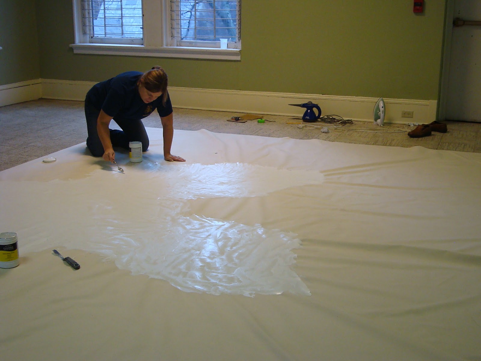
My mom helped me prepare my project canvas.  I ordered folded, not primed, medium duck. It measured as 12'x 18'. It didn't come as a role, it came as a big folded thing inside a giant zip-lock bag in a box . I asked my church if they would let me use one of the large auditoriums to do the work, to which they said yes.  First,   We cut it to size, which was not easy.  It was so difficult because of its size and because it was not a perfect rectangle to begin with.  Then we ironed it.  It was very hard to smooth out. I was actually getting concerned at one point that  I would warp the cut piece, especially considering the steam from our irons.  After that was done, we folded over the edges and ironed in fusing tape.  Fusing tape, when melted, gets into the fibers of the canvas and fuses everything together.  After that, we flipped the canvas over  to prime.  I had us use palette knives to do this (as if we were laying plaster).  We started in the middle and worked our way out.  This was also a difficult because the canvas mysteriously shrunk when we put the gesso on it.  So, unless I wanted a weird ripply surface, we really had to start in the middle.  Unfortuneately, we ran out of primer, so we couldn't finnish.  I now have more primer, so within the next week, I will be completeing the first coat of primer.  If i have enough when I'm done, I will knife on another thick layer for extra support.  I have decided to hang it unstreched via intustrial Velcro.

Images of thesis canvas preperation


Final Resume


Diana Maye Whitener
21 Buffa Dr. Somerset, NJ 08873
732-977-9759
dwhitene@eden.rutgers.edu
http://dianamayewhitener.blogspot.com/
Education
BFA 2012 Mason Gross School of the Arts, Rutgers University
Grants/Awards
2010, Dean’s Choice Award, BFA Annual Show, Mason Gross School of the Arts
Group Exhibitions
2010 Mason Gross Annual, Water
2007  Mason Gross School of the Arts, Rutgers University, BFA
Commissions
2010 Portrait, Dr. Mark A. Boyle
2008 original piece, Joseph Hill and Reid Powell
2006 original piece, Dr. A. Vosey
2010 Sold Hot tub No. 6
Current Employment
Christ Church, New Brunswick. Section leader in volunteer choir

Final artist's statement


Artist’s Statement

I paint images that either represent or connect to water.    I create very realized and focused images but physically paint them abstractly.  I don’t paint to represent. I call myself a figurative abstract impressionist. I also am a color theorist, so I am very deliberate with my color. My images are very intimate and spiritual, featuring light, water, color, and the figure. I’ve been painting water for nearly three years.  I haven’t yet grown tired of the subject and continue to learn from it painting by painting.